Last year, my good friend Tanarra asked me if I was interested in submitting a painting for her daughter’s school’s charity auction. As I am a sucker for charity, kids, the cause of education, and any excuse to have a project, I said yes. As my usual subject matter isn’t exactly “grade school” ready, I had to come up with a composition that didn’t reflect my personal existential horror show.
Of course, because I can’t help myself, even after choosing a composition that reflects the “hopeless romantic” side of personality, I went for a sort of duotone color palette. In the end, I was really happy with how it came out.
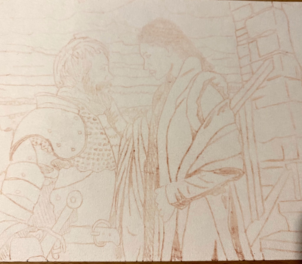
I did my initial sketch for the composition at 5×7 inches on paper with pencil. I used my new Repaper device and really liked it.
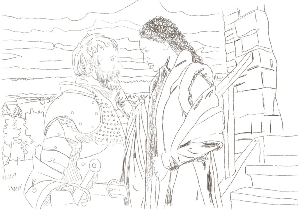
One thing I really liked about the Repaper tool is it let me quickly turn a sketch into a digital file I can print up as the scale I need (this case 24 x 38 inches) to transfer to a canvas.
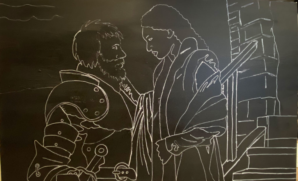
I like to work on black gessoed surfaces and use a white acrylic marker to block out the composition.
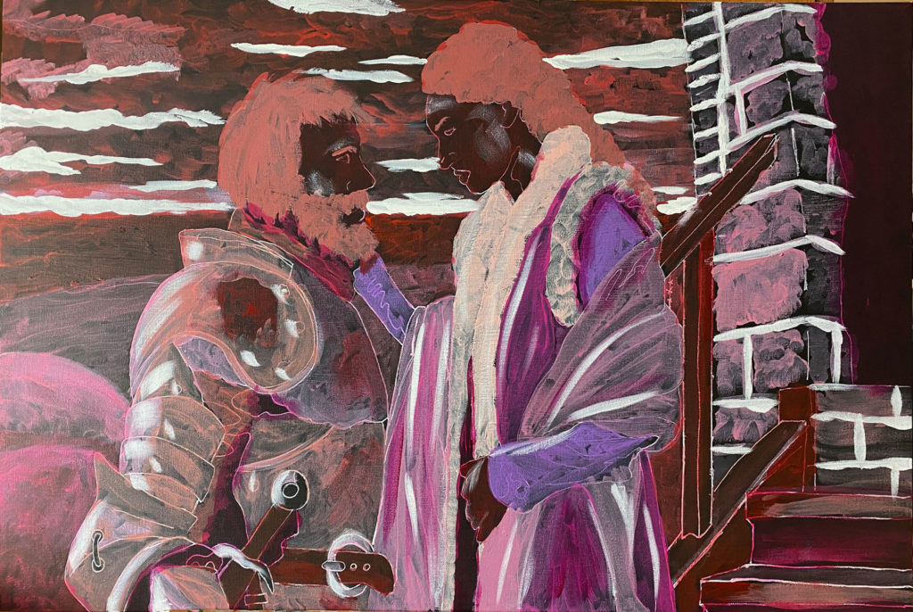
I like to layer colors when working in acrylics. Very rarely do I end with these colors, bu it lets me set the stage and experiment.
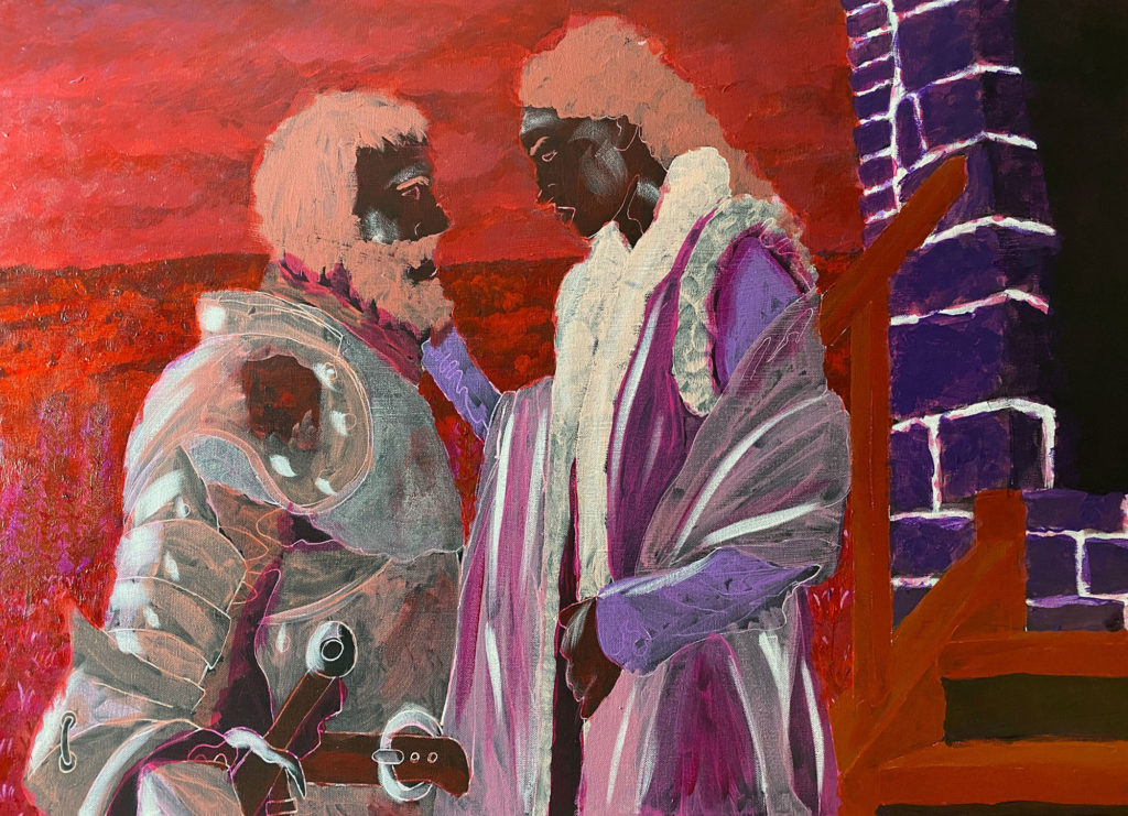
I try to layer in colors, working the background first and making my way to the foreground.
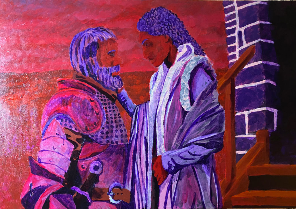
As I start pulling together the foreground colors of the painting, I start to see where I am going to end. It is always an exciting moment for me.
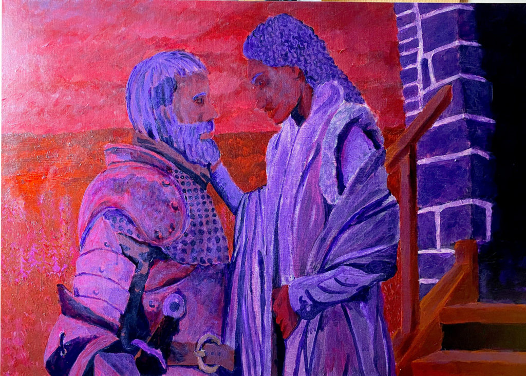
I’ve gotten pretty good at using glazes to build up colors. I always avoided them in the past, but now feel like they are a fantastic tool for my toolkit.
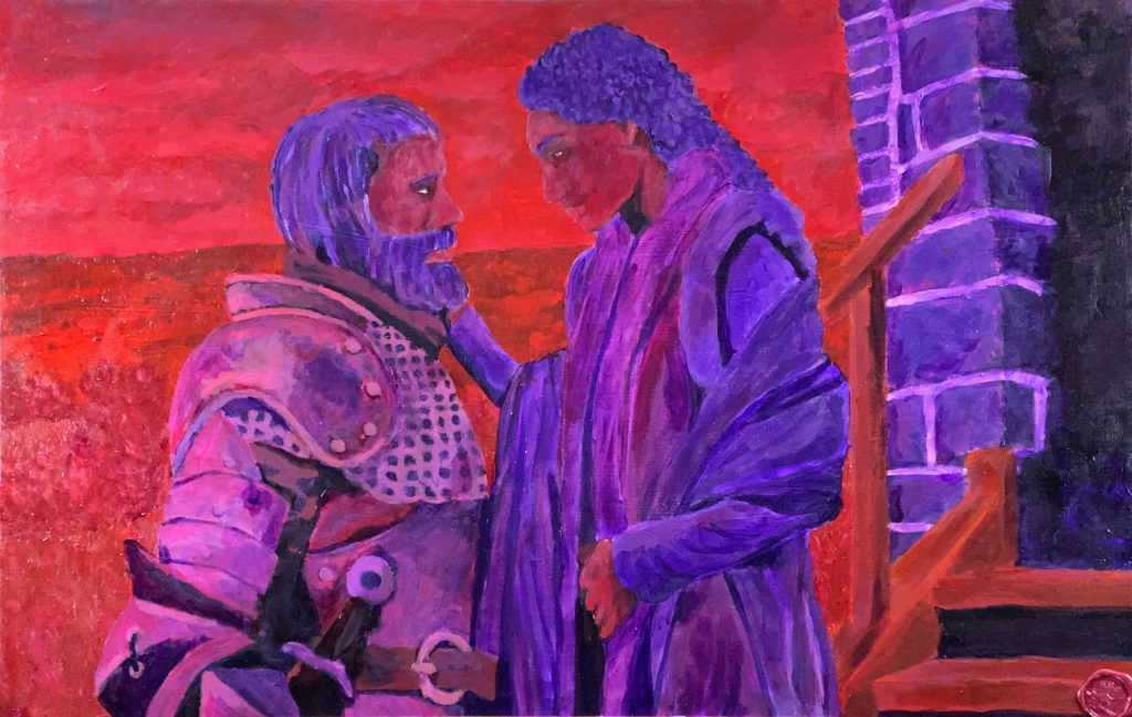
In the end, I am really happy with how this came out. I feel like I am really starting to hit my stride with acrylic paint.